Color illustrates a huge aspect of our lives. All the different colors we encounter during everyday life influence our mood, behavior, and choices. Colors we see, such as the serene blue of the sky, the earthy green of roadside trees, and the vivid yellow of taxi cabs, can change our mood. Our experiences shape our preferences and based on these preferences, we, subconsciously and sometimes consciously, associate certain colors with feelings. For example, some people might feel relaxed when they see the color purple, and some people might feel threatened by the color red. Culture can also influence our perception of color. In South Africa, ‘red’ symbolizes mourning and violence, whereas in China, the color represents long-life and prosperity. Marketing campaigns use color to influence consumer choice. People may be more prone to choose a certain product based on their own color associations and preferences. Color is also connected with language. We use phrases such as “out of the blue” or “once in a blue moon” to evoke certain emotions, and “black sheep of the family” or “a white lie” to connote positive or negative meaning. In technology, emojis easily communicate emotions through color associations, like the red-faced emoji for showing madness, the green-faced emoji for expressing disgust, and the purple-faced demon emoji for grabbing attention. In short, we live in a world of colors which shape our daily lives.
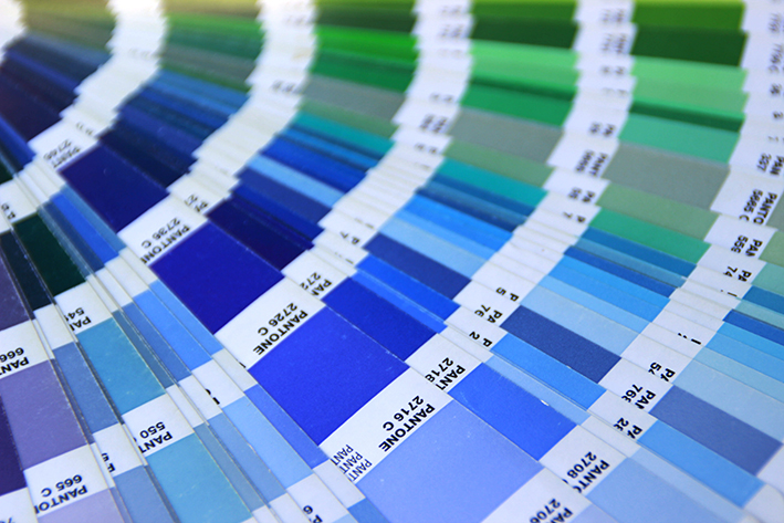
Pantone has been a powerful influence in the color industry ever since it was established in 1962. The company came up with PMS, the Pantone Matching System, in 1963, an organized coloring standard that determined the hue, name, and numbering of specific colors. The PMS and Pantone Guides enabled numerous designers and producers to communicate color palettes and specific product colors without confusion. Every color-conscious industry and manufacturer heavily relies on PMS to accurately illustrate colors. As a result, the color chip, color tones, and numbering system of Pantone have become an iconic symbol of the company itself.
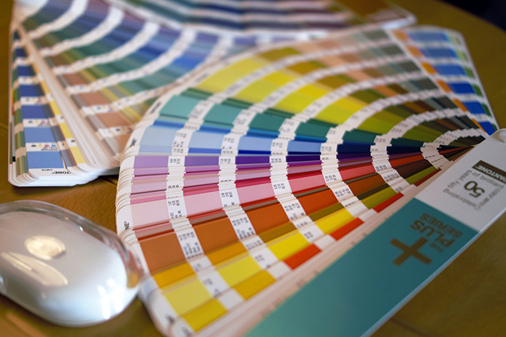
In 1999, the company announced Cerulean Blue as the official color of the Millennium, and this became the first Pantone Color of the Year. Ever since, Pantone has annually announced the Color of the Year, a symbol and expression of the current trends and people. Pantone decides the Color of the Year after reviewing a detailed trend analysis and after thoughtful consideration from color experts. Pantone’s Color of the Year influences multiple industries including fashion, home furnishing, industrial design, and graphic design. The Color of the Year 2020, Classic Blue, was announced in early December. Classic Blue is akin to the calming blue hue of a vast evening sky. In an interview with TIME, the vice president of Pantone Color Institute, Laurie Pressman, explained that Classic Blue represents dependability, trustworthiness, credibility, and constancy, traits that are valued in this current fast-paced, technology-oriented world. [Full text for the interview article can be found on the link: https://time.com/5744039/pantone-color-of-the-year-2020/] Entering the new decade in 2020, the Pantone Color Institute expects this color to “bring a sense of peace and tranquility to the human spirit, offering refuge” to the people. The boundless blue of Classic Blue “encourages the people to think beyond the obvious.” [Full text for the Pantone Color Institute’s introduction of Classic Blue can be found on the link: https://www.pantone.com/color-intelligence/color-of-the-year/color-of-the-year-2020]
The Pantone Color Institute collaborated with SFactory, a multiplex cultural space in Seongsu-dong, Korea, to hold a color exhibition, “Museum of Colors.” This pop-up exhibition focused on reinterpreting the notion of color with photographs, drawings, and paintings. Each of the nine different rooms of the exhibition introduces a specific color as a theme and artworks that showcase this theme. Each room, with different lighting and interior, briefly explains the history and significance of the color and introduces the artist and its work. The third room of the exhibition, dedicated to the Pantone Color Institute, presents the history and future of Pantone’s color universe, the world of diverse hues Pantone established. After the announcement of the 2020 Color of the Year, a huge color chip of Classic Blue was displayed in the room. Pictures of the exhibition can be found on the official “Museum of Colors” Instagram account @museumofcolors.official, https://www.instagram.com/museumofcolors.official/.
Other artists who participated are Russian photographer Kristina Makeevam, Korean furniture designer Yoon Sae-Rom, Korean publishing company Creation and Criticism, English photographer Lynne Douglas, Turkish photographer Yener Torun, and Korean illustrator Artnum. One unique characteristic of this exhibition was that it displayed various forms and sizes of artworks, such as the installation art, dining table, oversized color chips, and a small garden. It was interesting to see how the mood of the room changed every time I entered a new room with new colors. One impressive room was the fifth room, titled ‘Sky Island.’ In the room, there was a series by English photographer Lynne Douglas which focused on photos of the sea and the sky. Each photograph showed various colors among the wide spectrum of blue in nature.
The objective of the exhibition “Museum of Colors” was to let people understand the magnificence and meaning of different colors by taking a look at various artworks. The exhibition “Museum of Colors” is held until March 15, 2020. [Additional information can be found on the following link: https://www.museumofcolors.kr/] By introducing us to the history of the Pantone Color Institute, the Pantone Color of the Year, and the various tones of color, the exhibition offers a new insight about the world coming into this new decade and a chance to live a world of colors.

Moonyoung (Rosy) Bang
Sophomore (Grade 10)
Gangnam International School