The outbreak of COVID-19 has made museum and gallery visit more challenging. As an art student, this was more devastating because many inspirations and creative thoughts came from looking at various artworks in these visits. Due to this, I was more excited to hear that Louis Vuitton Seoul was hosting an exhibition of Gerhard Richter’s work.
Not only had it been long since I visited any galleries, but Gerhard Richter was also one of my biggest inspirations for my Advancement Placement Drawing course this year. Gerhard Richer is a German painter who uses concepts between figurative and abstract art, varying from photography-based portraits or landscape and still-life paintings, to gestural and monochrome abstractions.
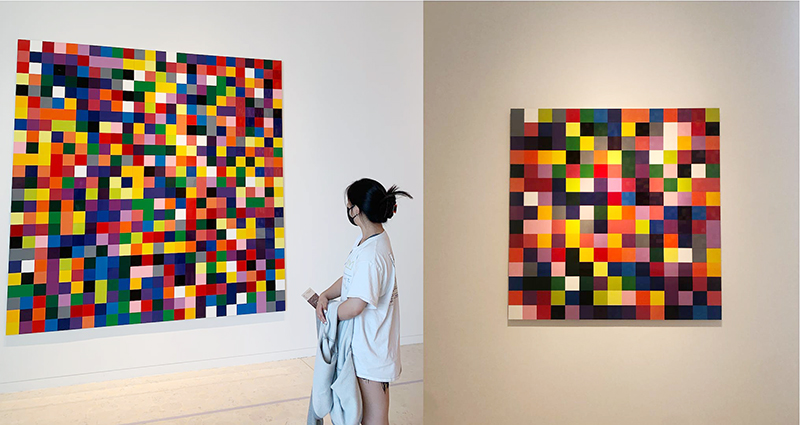
On June 8th, 2021, I visited Espace Louis Vuitton Seoul located in Apgujeong. For this exhibition, the primary display was Gerhard Richter’s 4900 colours. 4900 Colours (2007) is a unique piece that comprises of brightly coloured squares randomly arranged in a grid formation. At first glance, the work may seem relatively simple and plain. There are three primary works, each becoming larger with the inclusion of more squares, with the largest piece consisting of two cubes of the same size next to each other. Why did he create three of the same works in different sizes?
4900 Colours (2007) was a project assigned to Gerhard Richter by the Cologne Cathedral. Located in Germany, the Cologne Cathedral asked him to create a new design that would replace the stained glass that had been destroyed during the Second World War. While many expected Richter to re-create the traditional depiction of secular and Christian rulers, instead, he used a random number generator to arrange 72 colors of squares into the window. He produced the 196 panels of 25 coloured squares that can be re-configured in 11 variations. Ranging from one large-scale painting to multiple, smaller paintings of varying sizes, which received both acclaim and criticism for its divergence of traditional cathedral designs.
His works were particularly significant to me because of his distinct mix of calculated, static touches with abstract, free strokes. In connection to my AP theme of “nostalgia’ many of his works, which looked like old photographs being erased, became a great source of inspiration.
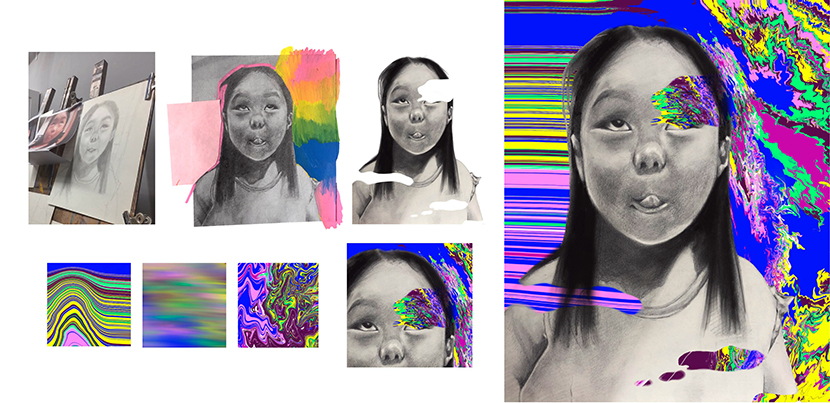
His use of computer programs in creating artworks was also a big push for me to start using digital mediums. I used old photographs for detailed pencil drawings and digital manipulation on top using the Procreate App. I re-enacted the sense of Richter’s contrast between traditional and new mediums to signify present as past, as well as decay of memories through digital distortions.
In times of COVID-19, I felt that the colorful exhibition became a powerful inspiration to me and my future as an art student. His use of digital programs also broke a lot of the bias against digital mediums in the art world, as it was rare for painters to incorporate and develop into using digital mediums. I believe it is a new yet critical step for the development of art in a world of growing technology and tools.
Other than his works, this visit also reminded me of the importance of artist study and research, especially in the means of physically visiting galleries and exhibitions when there is an opportunity. Rather than looking for inspiration at home through a computer screen, the act of visiting the gallery and looking at physical works brought a new sensation of liveliness, as I interacted with the works and other viewers.
Asuka Kurebayashi
Grade 11
Seoul International School